Contextual Healing
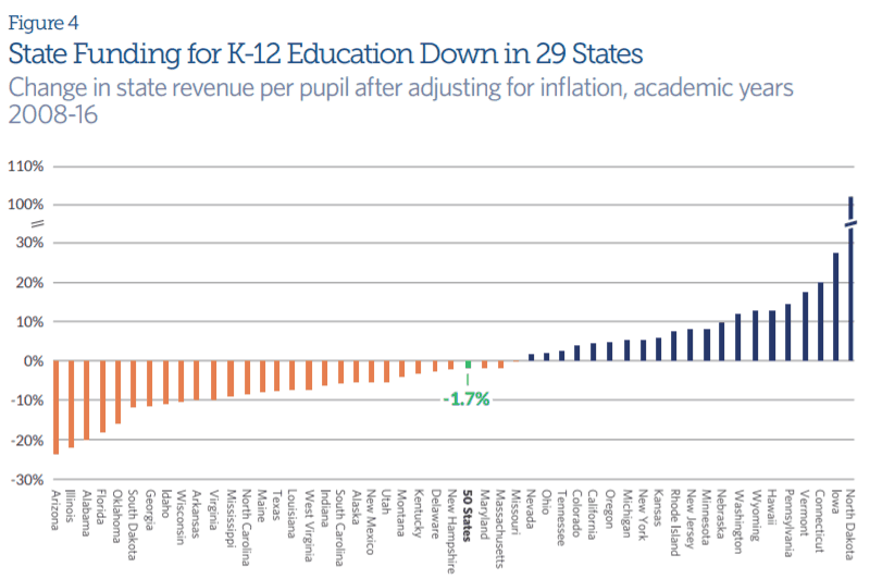
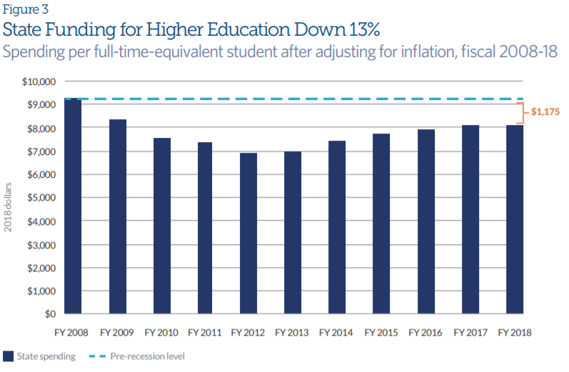
Pew released an issue brief this week looking at the impact of the recession on state finances 10 years later. The short story is that while many states are financially better off in 2019 than they have been in the past 10 years, they are still feeling the effects of recession era spending cuts in areas like infrastructure and education. They say a picture is worth a thousand words, so to get a quick overview of the brief, scroll through these 10 charts. Here are a few noteworthy ones:

The Other 49
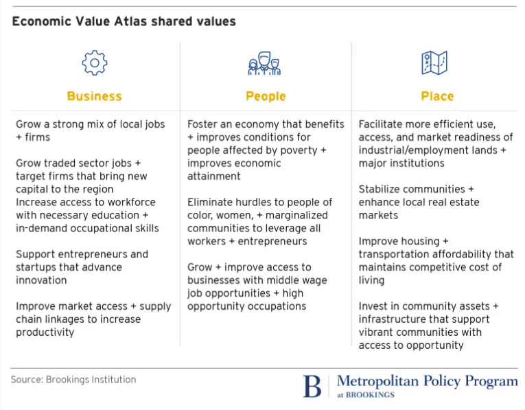
Brookings Institute worked with Metro – Portland, Oregon’s metropolitan planning organization, to create what they call an Economic Value Atlas (EVA). The goal of the EVA is “to better align economic development, regional planning, and infrastructure investment in support of regional economic goals.” The two things that stuck out as the most interesting aspects of this project : 1) the process through which they developed the EVA, and 2) the visual representation of different values.
The process: Brookings convened stakeholders from many different aspects of metropolitan life, from university research groups to community development organizations to business groups, to develop a set of shared economic values for Portland (see table below).
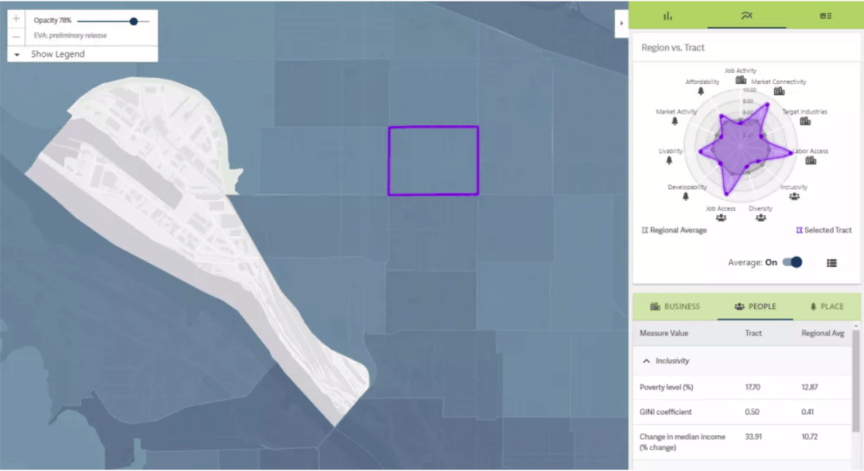
The visual representation of values: After deciding on the set of economic values, Brookings and Metro began building the EVA into a customizable, easy-to-use interface where users could see a wide range of data mapped by neighborhoods at the click of a button. To enable comparison across different datasets, they converted all datasets into standard scores with every indicator ranging from 0 to 10. Users can create maps based on different measures to look at trends and outliers.
For example, the map below scores neighborhoods on several measures associated with gentrification. The darker shaded areas on the map represent those most at risk for gentrification.
For Your Consideration
The Fordham Institute released a new study this week looking at teacher-student racial match in North Carolina charter schools compared to traditional public schools. Multiple studies have demonstrated the positive impact on students of having a teacher of the same race or ethnicity, but in most states, the racial makeup of the teaching force does not reflect the racial makeup of the students.
The study looked at data from third through fifth grade classrooms in North Carolina from 2006-07 to 2012-13 and found that:
- Traditional public schools and charter schools serve roughly the same percentage of black students, but charter schools have about 35% more black teachers
- Black students at charter schools are over 50% more likely to have a black teacher than black students at traditional public schools
The study did not find a statistically significant effect of higher student-teacher racial match on test scores, however, which the authors suggest is due to small sample size.
What we're reading

The Promise and Problem of Fake Meat
It could help improve public health and reduce climate change. But questions remain about the highly processed food—and some producers' coziness with the "real meat" industry.... Read the rest-
Tackling the Underrepresentation of Women in Media
-
Protected Bike Lanes Are Safer for Drivers, Too
-
What budget cuts during the Great Recession did to pupils’ test scores
-
Playing Teen Sports May Protect From Some Damages Of Childhood Trauma
-
The College Board tried a simple, cheap, research-backed way to push low-income kids into better colleges. It didn’t work.
-
Looks Can Sway Which Med Students Get Residency Offers